


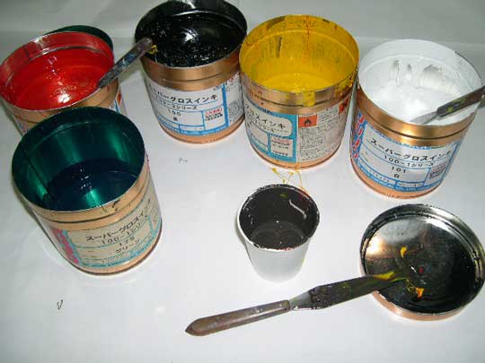
実際の調色例<2>An instance of color matching (2)
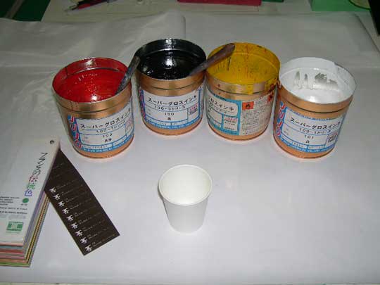
基本としてまず 黒・赤・黄・白から混ぜてゆきます。
この選色はやはり長い経験でしょうか。
予想配色割合 黄40%・黒20%・赤20%・白20%
First of all, I mix black, red, yellow, and white ink.
It’s basic way I learned by experience.
The following is the percentage of each color I thought in advance.
Yellow 40%, black 20%, red 20%, white 20%
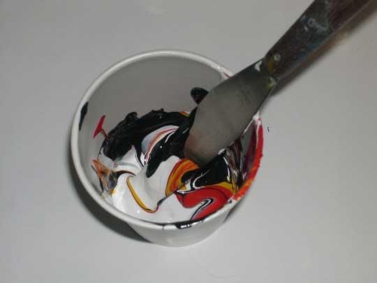
調色用の版で試し刷りをしながら
色を近づけてゆきます。
Printing repeatedly, through the screen for color-matching,
I bring the ink closer to the designated color.
いまいち深みというか 青みが足りないようです。
このような場合 すぐ青を入れるのではなく
12色相順に
グリーンを混ぜてゆきます。
(画像では微妙な色の違いが良く出ていません)
The color looks in short of depth and a tincture of blue a little.
In this case, I add green first, not blue immediately.
In the order of th12 basic hue circle, I tried to start with green
toward blue. (Sorry, I can't show the subtle shade on the blog)
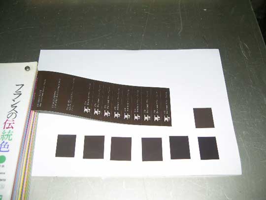
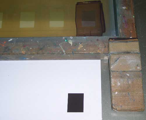
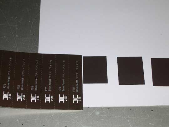
7回目の試刷りで最も近い色が出来ました。
結果配色割合 黄35%・黒25%・赤15%・白20%・緑5%
This is the closest color, after the seventh try.
This percentage is as follows,
Yellow 35%, black 25%, red 15%, white 20%, green 5%
つづく to be continued


基本としてまず 黒・赤・黄・白から混ぜてゆきます。
この選色はやはり長い経験でしょうか。
予想配色割合 黄40%・黒20%・赤20%・白20%
First of all, I mix black, red, yellow, and white ink.
It’s basic way I learned by experience.
The following is the percentage of each color I thought in advance.
Yellow 40%, black 20%, red 20%, white 20%
調色用の版で試し刷りをしながら
色を近づけてゆきます。
Printing repeatedly, through the screen for color-matching,
I bring the ink closer to the designated color.
いまいち深みというか 青みが足りないようです。
このような場合 すぐ青を入れるのではなく
12色相順に
グリーンを混ぜてゆきます。
(画像では微妙な色の違いが良く出ていません)
The color looks in short of depth and a tincture of blue a little.
In this case, I add green first, not blue immediately.
In the order of th12 basic hue circle, I tried to start with green
toward blue. (Sorry, I can't show the subtle shade on the blog)
7回目の試刷りで最も近い色が出来ました。
結果配色割合 黄35%・黒25%・赤15%・白20%・緑5%
This is the closest color, after the seventh try.
This percentage is as follows,
Yellow 35%, black 25%, red 15%, white 20%, green 5%
つづく to be continued


面倒くさがりの私には、 考えられない作業で、 気が遠くなってしまします。 すごいなぁ~☆☆☆
最近、韓国ドラマのせいか、 ジャージャーメンに凝ってっていますが、 keiさんはジャージャーメンはいかがですか?
多分かなり昔に食べた記憶があります。
その後食べていないところを見ると
その時は いい印象ではなかったでしょう。
でも今度再挑戦してみます。
焼きそばは好きなので いけるとは 思うのですが.....
基本的に麺は大好きなんですが 冷し中華の他に
苦手が2つあります。
担々麺 どうもあのすり胡麻が......
きしめん どうもあのビロビロさが......
変ですね。