彼の形体に対する感覚は、1920年以来成熟して来ていました; 形体達は、丸っこく充実し、
より深い空間の中に見られました。 しかし彼の初期の作品の装飾的価値は失われていません;
それらは今、より自然主義的観点でコーディネートされています。 形体の変形は、より繊細になりました。
彼はいまだに物体を上から見た様に表現する傾向があります、物体の形状に
最も重要な有用性を与えるため;注解、そんなに床が上に傾いたり、
机の上が真上から見えたりしますか。 彼の色は、いまだにアース・カラー寄りですが、
1930年代を通して着実にその
色彩領域を拡げていました、よりいっそう発色がよくなり、そして以前に使っていなかった
青や寒色系の色調を加えています。 キャンバスの白地は、透明性と輝きを与えるためよく
使われました。
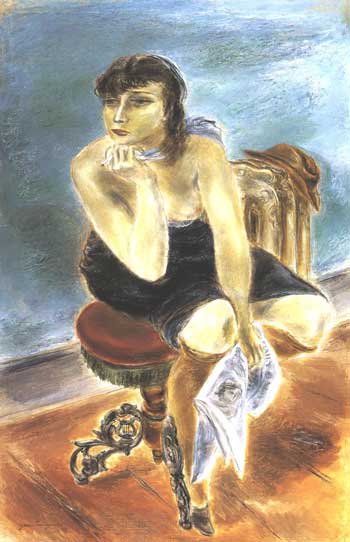
"Daily News", 1935. Oil on Canvas. ( 50 x 33 inches). Cincinnati Art Museum, Ohio.
Edwin and Virginia Irwin Memorial.
His sense of form had matured since the 1920's; forms were rounder and
fuller, and seen in deeper space. But the decorative values of his early work had
not been lose; they were now coordinated with a more naturalistic viewpoint. The
distortions were subtler. He still tended to represent things as seen from above,
so as to give the utmost value to their shapes; note how often the floor slants up-
wards or a table top is seen from above. His color was still on the earthy side,
but its range widened steadily through the 1930's, becoming more and more
luminous, and adding tones of blue and cool colors that he had not used be-
fore. The white of the canvas was used increasingly to give translucency and
brilliance.
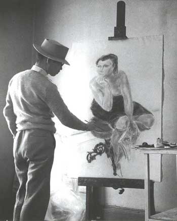
クニヨシ・イン・ニュー・ヨーク・スタジオ
より深い空間の中に見られました。 しかし彼の初期の作品の装飾的価値は失われていません;
それらは今、より自然主義的観点でコーディネートされています。 形体の変形は、より繊細になりました。
彼はいまだに物体を上から見た様に表現する傾向があります、物体の形状に
最も重要な有用性を与えるため;注解、そんなに床が上に傾いたり、
机の上が真上から見えたりしますか。 彼の色は、いまだにアース・カラー寄りですが、
1930年代を通して着実にその
色彩領域を拡げていました、よりいっそう発色がよくなり、そして以前に使っていなかった
青や寒色系の色調を加えています。 キャンバスの白地は、透明性と輝きを与えるためよく
使われました。
"Daily News", 1935. Oil on Canvas. ( 50 x 33 inches). Cincinnati Art Museum, Ohio.
Edwin and Virginia Irwin Memorial.
His sense of form had matured since the 1920's; forms were rounder and
fuller, and seen in deeper space. But the decorative values of his early work had
not been lose; they were now coordinated with a more naturalistic viewpoint. The
distortions were subtler. He still tended to represent things as seen from above,
so as to give the utmost value to their shapes; note how often the floor slants up-
wards or a table top is seen from above. His color was still on the earthy side,
but its range widened steadily through the 1930's, becoming more and more
luminous, and adding tones of blue and cool colors that he had not used be-
fore. The white of the canvas was used increasingly to give translucency and
brilliance.
クニヨシ・イン・ニュー・ヨーク・スタジオ