裏 RjpWiki

Julia ときどき R, Python によるコンピュータプログラム,コンピュータ・サイエンス,統計学

Julia に翻訳--232 ヒストグラム

2021年05月20日 | ブログラミング

#==========
Julia の修行をするときに,いろいろなプログラムを書き換えるのは有効な方法だ。
以下のプログラムを Julia に翻訳してみる。

ヒストグラム
https://oku.edu.mie-u.ac.jp/~okumura/python/hist.html

ファイル名: ヒストグラム.jl  関数名:

翻訳するときに書いたメモ

統計学においては最も基本的なグラフの一つである。それが故,「○○で描かれるヒストグラムはかっこ悪い」,「描くのが面倒だ」という批判もされやすい。
Julia で,まずまずのヒストグラムが描けただろうか?

==========#

using Plots
pyplot(grid=false, label="")

x = randn(1234);

histogram(x, tick_direction=:out)

histogram(x, color="lightgray", tick_direction=:out)

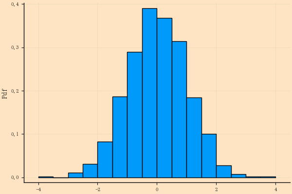
縦軸を何にするか,Julia では 4 通りある。

normalize: Bool or Symbol. Histogram normalization mode.
Possible values are:
    false/:none (no normalization, default),
    true/:pdf (normalize to a discrete Probability Density Function,
              
where the total area of the bins is 1),
    :probability (bin heights sum to 1) and
    :density (the area of each bin, rather than the height,
              is equal to the counts - useful for uneven bin sizes).

histogram(x, tick_direction=:out, bg=:bisque, grid=true,
    fg_color_grid=:green,
ylabel="Frequency")

histogram(x, normalize=:pdf, ylabel="Pdf", tick_direction=:out,

    bg=:bisque, grid=true, fg_color_grid=:green)
savefig("histogram.png")


histogram(x, normalize=:probability, ylabel="Probability",      
         
tick_direction=:out,
          bg=:bisque, grid=true, fg_color_grid=:green)

コメント
  • X
  • Facebookでシェアする
  • はてなブックマークに追加する
  • LINEでシェアする

Julia に翻訳--231 正規分布の密度関数を描く

2021年05月20日 | ブログラミング

#==========
Julia の修行をするときに,いろいろなプログラムを書き換えるのは有効な方法だ。
以下のプログラムを Julia に翻訳してみる。

正規分布の密度関数を描く
https://oku.edu.mie-u.ac.jp/~okumura/python/dnormcurve.html

ファイル名: dnormplot.jl  関数名:

翻訳するときに書いたメモ

==========#

> 正規分布の密度関数を描く

> まずは Matplotlib と NumPy だけで描いてみましょう。

> import matplotlib.pyplot as plt
> import numpy as np

> x = np.linspace(-3, 3, 101)  # 区間[-3,3]を100等分する101点
> y = np.exp(-x**2 / 2) / np.sqrt(2 * np.pi)
> plt.plot(x, y)

using Plots
pyplot(grid=false, label="")

densityfunction(x) = exp(-x^2 / 2) / sqrt(2π)
x = range(-3, 3, length=101);  # 区間[-3,3]を100等分する101点
y = densityfunction.(x);
plot(x, y, tick_direction=:out) # tick_direction=:out は pyplot() では宣言できない

# plot(x , x -> exp(-x ^2 / 2) / sqrt(2π)) # 遅い

> x ≧ 1 の部分だけ塗りつぶしてみましょう。

> plt.fill_between(x[x >= 1], y[x >= 1])

x2 = range(1, 3, length=101)  # 区間[-3,3]を100等分する101点
y2 = densityfunction.(x2);

plot!(x2, y2, fill=(0, :orange))
hline!([0])
savefig("fig1.png")

> 計算式を書くのが面倒なら,SciPy の scipy.stats.norm.pdf() を使います。この pdf は PDF ファイルのことではなく確率密度関数(probability density function)のことです。

> import matplotlib.pyplot as plt
> import numpy as np
> from scipy.stats import norm

> x = np.linspace(-3, 3, 101)  # 区間[-3,3]を100等分する101点
> plt.plot(x, norm.pdf(x))

> ちなみに R なら

> curve(dnorm(x), -3, 3)

> という1行で描けてしまいます

Rmath の dnorm() というのは,結局の所 R の dnorm() です。
R の curve() は(R のなかでも plot() のシュガーコートだし)Julia の plot() と同じです。

using Rmath
x = range(-3, 3, length=101);
plot(x, dnorm.(x))

関数名だけを引数にすることも,

plot(dnorm)

値域を指定することもできます。

plot(dnorm, xlims=(-3, 3))

コメント
  • X
  • Facebookでシェアする
  • はてなブックマークに追加する
  • LINEでシェアする

Julia に翻訳--230 seaborn によるプロット,散布図行列,R の plot()

2021年05月20日 | ブログラミング

#==========
Julia の修行をするときに,いろいろなプログラムを書き換えるのは有効な方法だ。
以下のプログラムを Julia に翻訳してみる。

seabornによるプロット
https://oku.edu.mie-u.ac.jp/~okumura/python/seaborn.html

ファイル名: pairplot.jl  使用する関数名: corrplot, cornerplot

翻訳するときに書いたメモ

参照元では serborn を使っているのだけど,Julia で seaborn を使うと,当たり前の反則になるので,Julia にある関数を使って描画する。
dataset() の右上にあるのは,ヒートマップのようだが,2値のヒートマップはわかりづらいとしかいえない。
cornerplot() のほうが R の pair() に近いかな。
いずれの関数も,パラメータは決め打ちなので,最適な画像を得るためには,状況によりマージン設定,マーカーサイズ,文字サイズを自分で決める必要がある。

==========#

using Plots, Plots.PlotMeasures
using StatsPlots, DataFrames

using RDatasets
iris = dataset("datasets", "iris");

gr( grid=false,
    left_margin=5mm,
    right_margin=-5mm, # 負の値も指定できる(というか,指定しないと綺麗な図にならない)
    top_margin=-5mm,
    bottom_margin=5mm)

@df iris corrplot([:SepalLength :SepalWidth :PetalLength :PetalWidth],
    tick_direction=:out, # マニュアルにもソースプログラムにも書いていないが,オプション指定ができる
    thickness_scaling = 0.7) # thickness_scaling と 上下左右のマージン設定は必須
savefig("fig1.png")

# x = randn(500, 5);
# corrplot(x)

############

gr( left_margin=5mm,
    right_margin=-5mm, # 負の値も指定できる(というか,指定しないと綺麗な図にならない)
    top_margin=-8mm,
    bottom_margin=5mm)

@df iris cornerplot([:SepalLength :SepalWidth :PetalLength :PetalWidth],
                    tick_direction=:out, # マニュアルにもソースプログラムにも書いていないが,オプション指定ができる
                    markersize=4, thickness_scaling = 0.7) # grid は 効かない
savefig("fig2.png")

# cornerplot(x, label=["x$i" for i = 1:5])
# cornerplot(x, compact=true, label=["x$i" for i = 1:5])

コメント
  • X
  • Facebookでシェアする
  • はてなブックマークに追加する
  • LINEでシェアする

Julia に翻訳--229 Collatzの問題

2021年05月20日 | ブログラミング

#==========
Julia の修行をするときに,いろいろなプログラムを書き換えるのは有効な方法だ。
以下のプログラムを Julia に翻訳してみる。

Collatzの問題
https://oku.edu.mie-u.ac.jp/~okumura/python/collatz.html

ファイル名: collatz.jl  関数名: collatz, collatzmax

翻訳するときに書いたメモ

いきなり規模を大きくすると火傷することがあるよ。

==========#

# #= ... =# は,複数行の注釈 (C++ などの /* ... */ に相当)

#=
def collatz(n):
    print(n, end="")
    while (n > 1):
        if (n % 2 == 0):
            n = n // 2
        else:
            n = 3 * n + 1
        print(" →", n, end="")
    print()

n = int(input('正の整数を入力してください: '))
collatz(n)
=#

function collatz(n)      # 末尾コロン不要
    print(n)             # 出力末尾改行なしの出力(出力末尾改行ありは println())
    while n > 1          # 条件式をくるくるカッコ対,末尾コロン不要
        if n % 2 == 0    # 末尾コロン不要
            n = n ÷ 2    # 整数除算
        else             # 末尾コロン不要
            n = 3n + 1   # 定数*変数の演算子は省略可
        end              # if を閉じる
        print(" → $n")   # 文字列中の $変数名 は変数の値で置換される
    end                  # while を閉じる
    println()            # 何も出力せず改行のみ
end                      # function 定義の終わり

print("正の整数を入力してください: ") # プロンプト機能は特にない
n = parse(Int, readline())      # 文字列として入力し,整数にパース
collatz(n)                      # 関数呼び出し

#=====
def collatz_max(n):
    nmax = n
    while (n > 1):
        if (n % 2 == 0):
            n = n // 2
        else:
            n = 3 * n + 1
            if n > nmax:
                nmax = n
    return nmax

mmax = 0
for n in range(10000):
    m = collatz(n)
    if m > mmax:
        print(n, m)
        mmax = m
=====#

function collatzmax(n) # Julia では 変数名,関数名に _ の使用は非推奨
    nmax = n
    while n > 1
        if n % 2 == 0
            n = n ÷ 2
        else
            n = 3n + 1
            n > nmax && (nmax = n) # Perl なんかにあるやつ
        end
    end
    return nmax
end

mmax = 0
for n = 0:9999 # Python の range(10000) は 0:9999
    m = collatzmax(n)
    if m > mmax
        println(n, " ", m) # Julia では,フィールドの区切り文字は空
        mmax = m
    end
end # for も end で閉じる

図を描く Python プログラムは提示されていないが,

図を描くために少し追加

results = []
mmax = 0
limit = 1e8
for n = 1:limit
    m = collatzmax(n)
    if m > mmax
        println(n, " ", m) # Julia では,フィールドの区切り文字は空
        mmax = m
        append!(results, (n, m))
    end
end # for も end で閉じる

collatzmax を若干修正する。
途中で n より小さい値になったら,収束することがわかるの(すでにチェック済みなので)で計算打ち切りにする。
これを入れないと死ぬほど時間が掛かる。

function collatzmax(n) # Julia では 変数名,関数名に _ の使用は非推奨
    n0 = n # 後々のために追加
    nmax = n
    while n > 1
        if n % 2 == 0
            n = n ÷ 2
        else
            n = 3n + 1
            n > nmax && (nmax = n) # Perl なんかにあるやつ
        end
        n < n0 && break # n0 より小さくなったら収束するに決まっている!
    end
    return nmax
end

using Plots
pyplot( scale=:log10, # 両対数軸で描く
        grid=false, tick_direction=:out, label="")
plot(   results[1:2:end],
        results[2:2:end],
        markershape=:circle)
plot!(  [1, limit],
        [1, limit^2],
        color=:orange)

コメント
  • X
  • Facebookでシェアする
  • はてなブックマークに追加する
  • LINEでシェアする

PVアクセスランキング にほんブログ村

PVアクセスランキング にほんブログ村