裏 RjpWiki

Julia ときどき R, Python によるコンピュータプログラム,コンピュータ・サイエンス,統計学

Julia に翻訳--011 2 群のヒストグラム

2021年02月28日 | ブログラミング

#==========
Julia の修行をするときに,いろいろなプログラムを書き換えるのは有効な方法だ。
以下のプログラムを Julia に翻訳してみる。

2 群のヒストグラム
http://aoki2.si.gunma-u.ac.jp/R/hist2.html

ファイル名: hist2.jl  関数名: hist2

翻訳するときに書いたメモ

R では当時はヒストグラムの重ね描きはできなかった(いまでも base の R ではできない。ggplot は知らないが)。
Julia では PyPlot の plt.hist(),Plots の histogram() でできる。
でも少し機能が足りないところもあるので,自前の関数を書いてそこを補う位の意義はあるであろう。

using PyPlot
plt.hist((x1, x2), bins = -6:0.5:12, density = true, rwidth = 1)
plt.hist((x1, x2), bins = -6:0.5:12, density = false, rwidth = 1)

using Plots
histogram([x1, x2], bins = -6:0.5:12, normalize = true, bar_width = 0.5,
            alpha = 0.5, ylabel = "Density", label = "")
histogram([x1, x2], bins = -6:0.5:12, normalize = false, bar_width = 0.5,
            alpha = 0.5, ylabel = "Frequency", label = "")
histogram([x1, x2], bins = -6:0.5:12, normalize = :density, bar_width = 0.5,
            alpha = 0.5, ylabel = "Density", label = "")

==========#

using Plots

function hist2(x1, x2; n = 30, minx = -Inf, width = Inf, density = false,
                color1 = "darkkhaki", color2 = "silver", alpha = 0.7)
    function getfreq(x, minx, width, nclass)
        tbl = zeros(nclass)
        for i in floor.(Int, (x .- minx) ./ width .+ 1)
            tbl[i] += 1
        end
        return tbl
    end
    pyplot()
    x = vcat(x1, x2)
    maxx = maximum(x)
    if minx == -Inf || width == Inf
        minx = minimum(x)
        width = (maxx - minx) / n
    end
    nclass = floor(Int, (maxx - minx) / width) + 1
    t = getfreq(x1, minx, width, nclass)
    u = getfreq(x2, minx, width, nclass)
    if density
        t ./= width * length(x1)
        u ./= width * length(x2)
    end
    bar(((0:length(t)-1) .+ 0.25) .* width .+ minx, t, bar_width = 0.5width, label = "")
    bar!(((0:length(u)-1) .+ 0.75) .* width .+ minx, u, bar_width = 0.5width, label = "")
    plot!(ylabel = density ? "Density" : "Frequency")
end

using Random
Random.seed!(123);
x1 = randn(10000);
x2 = randn(20000) .* 2 .+ 3;

hist2(x1, x2, minx = -6, width = 0.5)


hist2(x1, x2, minx = -6, width = 0.5, density = true)

コメント
  • X
  • Facebookでシェアする
  • はてなブックマークに追加する
  • LINEでシェアする

Julia に翻訳--010 対数軸でのプロット

2021年02月27日 | ブログラミング

#==========
Julia の修行をするときに,いろいろなプログラムを書き換えるのは有効な方法だ。
以下のプログラムを Julia に翻訳してみる。

対数軸でのプロット
http://aoki2.si.gunma-u.ac.jp/R/log-plot.html

ファイル名: logplot.jl  関数名: logplot

翻訳するときに書いたメモ

takelog で "xy", "x", "y", "" を指定することにした。
デフォルトでは,普通の x-y グラフを描くことになる。

==========#

using Plots

function logplot(x, y; takelog = "", xlab = "x", ylab = "y", main = "", color = "gray")
    function logaxis(z)
        pos = zeros(100)
        minval = minimum(z)
        maxval = maximum(z)
        logmaxval = log10(maxval)
        logminval = log10(minval)
        width = logmaxval - logminval
        factor = logmaxval < 3.5 ? 15 : 8
        w = width / factor
        st = floor(logminval)
        delta = 10^st
        ic = 0
        while true
            for i = 1:9
                v = i * delta
                if minval - delta <= v <= maxval + delta
                    if (i == 1 || ic == 0) || (ic > 0 && log10(v) - pos[ic] > w)
                        if i == 1 && ic > 0 && log10(v) - pos[ic] <= w
                            ic -= 1
                        end
                        ic += 1
                        pos[ic] = log10(v)
                        prev = v
                    end
                end
            end
            delta *= 10
            if delta > maxval
                break
            end
        end
        return ic > 3 ? pos[2:ic-1] : [logminval, median([logminval, logmaxval]), logmaxval]
    end
    pyplot()
    logy = log10.(y)
    posy = logaxis(y)
    logx = log10.(x)
    posx = logaxis(x)
    if 'x' in takelog && 'y' in takelog
        plt = scatter(logx, logy, label = "")
        yticks!(posy, string.(round.(10 .^ posy, digits = 1)))
        xticks!(posx, string.(round.(10 .^ posx, digits = 1)))
    elseif 'y' in takelog
        plt = scatter(x, logy, label = "")
        yticks!(posy, string.(round.(10 .^ posy, digits = 1)))
    elseif 'x' in takelog
        plt = scatter(logx, y, label = "")
        xticks!(posx, string.(round.(10 .^ posx, digits = 1)))
    else
        plt = scatter(x, y, label = "")
    end
    plt = plot!(xlabel = xlab, ylabel = ylab, title = main)
    display(plt)
end

x = collect(1:0.5:9.5);
y = exp.(x);
logplot(x, y, main = "simple x : y graph")


logplot(x, y, takelog = "y", main = "semilog graph  x : log(y)")


logplot(y, x, takelog = "x", main = "semilog graph  log(x) : y")

x = 2 .^ collect(range(1, 5, length = 10));
y = 1.3 .^ collect(range(2, 10, length = 10));
logplot(x, y, takelog = "xy", main = "log-log graph  log(x) : log(y)")

コメント
  • X
  • Facebookでシェアする
  • はてなブックマークに追加する
  • LINEでシェアする

Julia に翻訳--009 度数分布表を与えて,正規分布へのあてはめを行い,指定によっては図を描く

2021年02月27日 | ブログラミング

#==========
Julia の修行をするときに,いろいろなプログラムを書き換えるのは有効な方法だ。
以下のプログラムを Julia に翻訳してみる。

度数分布表を与えて,正規分布へのあてはめを行い,指定によっては図を描く
http://aoki2.si.gunma-u.ac.jp/R/fit_normal.html

ファイル名: fitnormal.jl  関数名: fitnormal

翻訳するときに書いたメモ

図を描いた後に stdout に何らかの出力を追加すると,図が自動的には表示されない。
そのため,display() を億必要があるが,atom で実行していると図が 2 回出力されて煩わしい。

using で指定するパッケージに含まれる変数を,自分のプログラムでも使ってしまうと面倒なことになる。
==========#

using Distributions, Printf, Plots

function fitnormal(freq, lowerbound, width; accuracy = 0, method = "density",
                   xlab = "\$x\$", ylab = "\$f(x)\$", plotflag = true,
                   col = "cornsilk", col1 = "blueviolet", col2 = "chartreuse4",
                   verbose = true,)
    # method: "density" / "area"
    freq = vcat(0, freq, 0)
    m = length(freq)
    x = (lowerbound - accuracy / 2 - 3 * width / 2) .+ width .* collect(1:m)
    n = sum(freq)
    samplemean = sum(freq .* x) / n
    sd = sqrt(sum(freq .* x .^ 2) / n - samplemean^2)
    if method == "area"
        z = (x .+ (width / 2 - samplemean)) ./ sd
        F = cdf.(Normal(), z)
        F[end] = 1
        p = F .- vcat(0, F[1:end-1])
    else
        z = (x .- samplemean) ./ sd
        p = pdf.(Normal(), z) .* (width / sd)
    end
    expectation = n * p
    if verbose
        println("正規分布へのあてはめ (method = \"$method\")\n")
        @printf("推定された統計量  平均値 = %.7g  標準偏差 = %.7g\n\n", samplemean, sd)
        println("   級中心    頻度      z 値       密度      期待値")
        for i = 1:size(x, 1)
            @printf("%8.4f %6i %9.3f %9.5f %10.2f\n",
                    x[i], freq[i], z[i], p[i], expectation[i])
        end
        @printf("     合計 %6i %19.5f %10.2f\n", sum(freq), sum(p), sum(expectation))
    end
    if plotflag
        pyplot()
        xl = (lowerbound - width / 2) .+ width .* collect(0:m)
        plt = bar(xl, vcat(freq, 0) ./ n, bar_width = width, fillcolor = col,
                  grid = false, xlabel = xlab, ylabel = ylab, label = "")
        scatter!(x, p, markercolor = col2, markerstrokecolor = col2, label = "")
        x2 = range(x[1], x[m], length = 100)
        plot!(x2, pdf(Normal(samplemean, sd), x2) * width, linecolor = col1, label = "")
        hline!([0], linecolor = "black", label = "")
        display(plt)
    end
    return Dict(:method => method, :mean => samplemean, :sd => sd, :x => x,
                :freq => freq, :z => z, :p => p, :expectation => expectation)
end

freq = [4, 19, 86, 177, 105, 33, 2]
a = fitnormal(freq, 40, 5)

正規分布へのあてはめ (method = "density")

推定された統計量  平均値 = 57.98122  標準偏差 = 5.133511

   級中心    頻度      z 値       密度      期待値
 37.5000      0    -3.990   0.00014       0.06
 42.5000      4    -3.016   0.00412       1.75
 47.5000     19    -2.042   0.04833      20.59
 52.5000     86    -1.068   0.21974      93.61
 57.5000    177    -0.094   0.38686     164.80
 62.5000    105     0.880   0.26376     112.36
 67.5000     33     1.854   0.06964      29.67
 72.5000      2     2.828   0.00712       3.03
 77.5000      0     3.802   0.00028       0.12
     合計    426             0.99999     426.00


a = fitnormal(freq, 40, 5, method = "area")

正規分布へのあてはめ (method = "area")

推定された統計量  平均値 = 57.98122  標準偏差 = 5.133511

   級中心    頻度      z 値       密度      期待値
 37.5000      0    -3.503   0.00023       0.10
 42.5000      4    -2.529   0.00549       2.34
 47.5000     19    -1.555   0.05428      23.12
 52.5000     86    -0.581   0.22070      94.02
 57.5000    177     0.393   0.37223     158.57
 62.5000    105     1.367   0.26129     111.31
 67.5000     33     2.341   0.07616      32.45
 72.5000      2     3.315   0.00915       3.90
 77.5000      0     4.289   0.00046       0.20
     合計    426             1.00000     426.00

コメント
  • X
  • Facebookでシェアする
  • はてなブックマークに追加する
  • LINEでシェアする

Julia に翻訳--008 測定値をワイブル確率紙にプロットする

2021年02月26日 | ブログラミング

#==========
Julia の修行をするときに,いろいろなプログラムを書き換えるのは有効な方法だ。
以下のプログラムを Julia に翻訳してみる。

測定値をワイブル確率紙にプロットする
http://aoki2.si.gunma-u.ac.jp/R/weibull.html

ファイル名: weibull.jl  関数名: weibull

翻訳するときに書いたメモ

対数正規確率紙を書いた後だから,簡単だった。

==========#

using Distributions, Plots, Plots.PlotMeasures

function weibull(x; leftmargin = 2mm, xlab = "観察値", ylab = "累積確率", main = "ワイブル確率紙")
    weib(p) = log10(log10(1 / (1 - p)))
    function logaxis(z)
        pos = zeros(100)
        minval = minimum(z)
        maxval = maximum(z)
        logmaxval = log10(maxval)
        logminval = log10(minval)
        width = logmaxval - logminval
        factor = logmaxval < 3.5 ? 15 : 8
        w = width / factor
        st = floor(logminval)
        delta = 10^st
        ic = 0
        while true
            for i = 1:9
                v = i * delta
                if minval - delta <= v <= maxval + delta
                    if (i == 1 || ic == 0) || (ic > 0 && log10(v) - pos[ic] > w)
                        if i == 1 && ic > 0 && log10(v) - pos[ic] <= w
                            ic -= 1
                        end
                        ic += 1

                        pos[ic] = log10(v)
                        prev = v
                    end
                end
            end
            delta *= 10
            if delta > maxval
                break
            end
        end
        return ic > 3 ? pos[2:ic-1] : [logminval, median([logminval, logmaxval]), logmaxval]
    end
    pyplot()
    n = length(x)
    logx = log10.(sort!(x))
    y = weib.((collect(1:n) .- 0.5) ./ n)
    y0 = vcat(
        10.0 .^ (-10:0),
        [5, 10, 20, 30, 40, 50, 60, 70, 80, 90, 95, 99, 99.9, 99.99, 99.999])
    y0 = y0[y0.>10/n]
    probability = weib.(y0 / 100)
    scatter(logx, y, label = "", xlabel = xlab, ylabel = ylab, title = main)
    yticks!(probability, string.(round.(y0, digits = 4)))
    pos = logaxis(x)
    xticks!(pos, string.(round.(10 .^ pos, digits = 1)))
end

x = [
    1.80531046285254,3.19311612835466,3.28834436413816,6.09849913246918,1.38753827431415,
    4.25956917997002,2.19512553656654,0.512283970489512,4.34705764607181,1.11953153395821,
    7.68555210540847,1.7643219025482,0.986773337068037,0.682127148920385,2.6323987051625,
    3.08191138366997,0.575444181661929,7.04322086787495,0.867594222227101,1.24874964755851,
    0.618424866491301,3.98775421377481,0.601446810729256,3.45839946486477,1.52155116044975,
    6.673646245403,1.1408427257711,0.231056233767167,4.62036593935406,0.568213427986162,
    2.49540860834656,1.18903624694958,0.886439743171324,2.1480855169868,4.52228064341519,
    1.15375714297612,5.86131383827675,0.215763115606156,3.32187592926364,0.542381907439051,
    2.47025306148576,2.40605148698434,2.84101535087403,1.52931862347578,0.669626351294388,
    3.40654318414194,1.77750271751872,5.56339366874868,0.626310926516198,6.24842979611537,
    3.15329814448187,2.97783388594968,4.72055464574222,4.97361132035854,2.71284323516702,
    3.84714124059119,0.411863928700296,1.25628023322285,1.43876907120354,2.90263414177699,
    1.52999869396695,0.933096212140327,2.62990034345694,0.765430620280283,3.39133399716817,
    1.80780059565393,1.37695181832508,2.64438749146156,1.21643677550211,1.72673120016061,
    3.31002652328123,1.00147436267977,3.12131155688389,3.17198635435594,2.21115310778158,
    1.15469936237419,2.50724717782027,4.06120539534992,5.13987643842686,4.78868160713468,
    0.837216840665425,0.755663424463497,4.18810116764077,6.56524669360705,6.42437126634158,
    6.28044699738115,1.08706640499649,1.84654965091899,2.3296569581759,2.90964806098607,];
weibull(x)


using Random
Random.seed!(123);
x = rand(20) .* 100 .+ 2.1;
weibull(x)

コメント
  • X
  • Facebookでシェアする
  • はてなブックマークに追加する
  • LINEでシェアする

Julia の小ネタ--005 : は ^ より演算順位が低い

2021年02月26日 | ブログラミング

10^-10, 10^-9, ..., 1 の数列を得ようとして

10 .^ -10:0 としても,1.0000000000000006e-10:1.0:-0.9999999999 になるだけ。これは何も含まない。
float.(1.0000000000000006e-10:1.0:-0.9999999999)Float64[] で「」である。: は ^ より演算順位が低いからである(R は逆)

それならば,これはどうだ。

10 .^ (-10:0) はエラーになる。

DomainError with -10:
Cannot raise an integer x to a negative power -10.
Make x or -10 a float by adding a zero decimal (e.g., 2.0^-10 or 2^-10.0 instead of 2^-10), or write 1/x^10, float(x)^-10, x^float(-10) or (x//1)^-10

解決策のサジェスチョンどおり,以下のようにすると

10.0 .^ (-10:0) または 10 .^ (-10.0:0) でやっと望みの結果が得られた。やれやれ。

コメント
  • X
  • Facebookでシェアする
  • はてなブックマークに追加する
  • LINEでシェアする

Julia に翻訳--007 対数正規確率紙に累積相対度数をプロットする

2021年02月26日 | ブログラミング

#==========
Julia の修行をするときに,いろいろなプログラムを書き換えるのは有効な方法だ。
以下のプログラムを Julia に翻訳してみる。

対数正規確率紙に累積相対度数をプロットする
http://aoki2.si.gunma-u.ac.jp/R/lnpp.html

ファイル名: lnpp.jl  関数名: lnpp

翻訳するときに書いたメモ

軸を対数目盛りにする :log はあるが,表示が 10^n などとなるので,指数表示ではなく元の数値の表示に従うように新たに軸メモリを計算する関数を作ったが,これが手こずった。

==========#

using Distributions, Plots, Plots.PlotMeasures

function lnpp(x; leftmargin = 2mm, xlab = "観察値", ylab = "累積確率",
              main = "対数正規確率紙")

    function logaxis(z)
        pos = zeros(100)
        minval = minimum(z)
        maxval = maximum(z)
        logmaxval = log10(maxval)
        logminval = log10(minval)
        width = logmaxval - logminval
        factor = logmaxval < 3.5 ? 15 : 8
        w = width / factor
        st = floor(logminval)
        delta = 10^st
        ic = 0
        while true
            for i = 1:9
                v = i * delta
                if minval - delta <= v <= maxval + delta
                    if (i == 1 || ic == 0) || (ic > 0 && log10(v) - pos[ic] > w)
                        if i == 1 && ic > 0 && log10(v) - pos[ic] <= w
                            ic -= 1
                        end
                        ic += 1

                        pos[ic] = log10(v)
                        prev = v
                    end
                end
            end
            delta *= 10
            if delta > maxval
                break
            end
        end
        return ic > 3 ? pos[2:ic-1] : [logminval, median([logminval, logmaxval]), logmaxval]
    end
    pyplot()
    n = length(x)
    logx = log10.(sort!(x))
    y = (collect(1:n) .- 0.5) ./ n
    qny = quantile(Normal(), y)
    probability = [0.01, 0.1, 1, 5, 10, 20, 30, 40, 50,
                   60, 70, 80, 90, 95, 99, 99.9, 99.99] / 100

    qnp = quantile(Normal(), probability)
    margin = (log10(maximum(x)) - log10(minimum(x))) / 600 * 30
    scatter(
        logx,
        qny,
        label = "",
        xlims = (log10(minimum(x)) - margin, log10(maximum(x)) + margin),
        ylims = (minimum(qny), maximum(qny)),
        xlabel = xlab,
        ylabel = ylab,
        title = main,
    )
    yticks!(qnp, string.(round.(probability, digits = 4)))
    hline!(qnp, linecolor = :gray, linestyle = :dot, label = "")
    pos = logaxis(x)
    xticks!(pos, string.(round.(10 .^ pos, digits = 1)))
end

using Random
Random.seed!(123)
x = randn(100) .* 10 .+ 80
lnpp(x)

x = [
    32.4978550221931,3.11052584094339,9.55400310478408,30.3645286610177,
    21.1624392829688,7.37476464691322,28.9129834585325,1.8042322428236,
    8.99964598570283,3.55895261576496,9.62585749164628,6.35726278028454,
    1.95005492569664,13.4876154673338,8.24295995200768,6.48532599314323,
    4.35588525758088,19.7888507959163,2.54536615538532,22.1792645172972,
    22.6290782281654,11.394279463117,1.62423013916794,1.61310795035265,
    32.1156725493402,24.4324047816443,4.62558675355759,5.9662576846906,
    1.67772428988997,3.96909669181296,12.3842951428101,4.75229826175545,
    3.14506115407662,10.8612899803449,3.24849536568508,11.4524807755855,
    8.44567923387873,7.53737447514118,16.0361633159583,30.5856770679345,
    34.2904590210926,37.4844432670513,25.5460725535086,5.04602127463469,
    3.10504378339411,28.8353322772864,7.37368663949144,42.5958262784602,
    0.946681530550752,9.42924224403108,]
lnpp(x)

コメント
  • X
  • Facebookでシェアする
  • はてなブックマークに追加する
  • LINEでシェアする

Julia に翻訳--006 正規確率紙に累積相対度数をプロットする

2021年02月25日 | ブログラミング

#==========
Julia の修行をするときに,いろいろなプログラムを書き換えるのは有効な方法だ。
以下のプログラムを Julia に翻訳してみる。

正規確率紙に累積相対度数をプロットする
http://aoki2.si.gunma-u.ac.jp/R/npp2.html

npp2 <- function(x) # データベクトル
{
        x <- x[!is.na(x)] # 欠損値を持つケースを除く
        n <- length(x) # データの個数
        x <- sort(x) # 昇順に並べ替える
        y <- (1:n-0.5)/n # 累積相対度数
        probs <- c(0.01, 0.1, 1, 5, 10, 20, 30, 40, 50, 60, 70, 80, 90, 95, 99, 99.9, 99.99)/100
        plot(c(x[1], x[n]), qnorm(c(probs[1], probs[17])), type="n", yaxt="n",
                xlab="Observed Value", ylab="Cumulative Percent",
                main="Normal Probability Paper")
        points(x, qnorm(y))
        axis(2, qnorm(probs), probs*100)
}

ファイル名: npp2.jl  関数名:npp2

翻訳するときに書いたメモ

npp() よりは簡単?
指数乱数は randexp() だった。R はその他の分布型の乱数も用意されているのになあ。

==========#

using Distributions, Plots, Plots.PlotMeasures

function npp2(x; leftmargin=2mm, xlab = "観察値", ylab = "累積確率",
        main = "正規確率紙")
    pyplot()
    x = collect(skipmissing(x))
    n = length(x)
    sort!(x)
    y = (collect(1:n) .- 0.5) ./ n;
    qny = quantile(Normal(), y);
    probability = [0.01, 0.1, 1, 5, 10, 20, 30, 40, 50,
        60, 70, 80, 90, 95, 99, 99.9, 99.99]/100;
    qnp = quantile(Normal(), probability)
    scatter(x, qny,
        tickdirection=:out,
        grid=false,
        label="",
        xlabel=xlab,
        ylabel=ylab,
        title=main,
        leftmargin=leftmargin,
        ylims=(minimum(qny), maximum(qny)),
        size=(600, 400))
    yticks!(qnp, string.(round.(probability, digits=4)))
    hline!(qnp, linecolor = :gray, linestyle=:dot, label="")
end

using Random

Random.seed!(123)
x = randn(100) # 正規乱数
npp2(x)

Random.seed!(123)
npp2(rand(100)) # 一様乱数

Random.seed!(123)
npp2(randexp(100)) # 指数乱数

コメント
  • X
  • Facebookでシェアする
  • はてなブックマークに追加する
  • LINEでシェアする

Julia に翻訳--005 機械学習のプログラム

2021年02月25日 | ブログラミング

機械学習ということであるが,例のごとく「機械的に」train:test = 8:2 に分割し,1 回だけの分析である。
以下の 2 つの結論だけを述べている。
「調整済みの決定係数が 0.5777 であった。特別良くもないが悪くもない結果だった。」
「テストデータの RMSE を評価する。 8.143424」

機械学習は,もっと統計学的見地からの分析を踏まえてやっておかないと,足下をすくわれる。
今回のデータセットのサンプルサイズは 414 である。これを 8:2 に分割すると,テストデータはサンプルサイズが 83 しかなくなる。
わずか 83 例でモデルの評価ができるのか??
しかも,このデータセットの従属変数には外れ値がある。全体からすれば 1/414 = 0.2% の外れ値であるが,この外れ値が 83 個のテストデータに含まれるような場合には,一挙に 1/83 = 1.2% を占めることになる。
そのため,評価に多かれ少なかれ影響を及ぼすことになる。
元のプログラムを Julia に書き換えると 30 倍速くなる。いいかえれば,同じ時間で R の30倍の回数のシミュレーションを行える。

30万回のシミュレーションを行うと,最初の図に示すように RMSE のヒストグラムを描くと右に瘤のある分布になっている。
この瘤の原因が 1 個の外れ値である。外れ値がテストデータに含まれるとこの瘤に含まれるのである。RMSE が 10.3 以上になったのが 約 20% である。
トレインデータで得られたモデルが有用であるとしても,テストデータであまり好ましくない評価を得られる確率が 20 % もあるのは甚だ不適切な話だ。
今回のデータは,トレインデータで得られたモデルもさして有用でないので,論外ではあるが。

この 1 個の外れ値を除いて同じく30万回のシミュレーションを行うと,RMSE は綺麗な分布を示す。

この後の議論は何段階かあるのだが,結論は以下のようになろう。

数少ないデータを細切れにしてモデルを作成して,信頼性を評価しようとしても,全体としてモデルの信頼性はさらに低くなるだけである。
逆に,十分な数のデータがあるときには,そこからどのようにデータを抽出・分割してもだいたい同じような結果が得られる。それが確率というものである。
機械的に機械学習を行ってはいけない。

#==========
Julia の修行をするときに,いろいろなプログラムを書き換えるのは有効な方法だ。
以下のプログラムを Julia に翻訳してみる。

某 qiita の r タグにある機械学習のプログラム

library(rsample)
df <- read.csv("Real_estate_valuation.csv")

#coln <- colnames(df) #列名を保存しておく
#colnames(df) <- c("No","X1","X2","X3","X4","X5","X6","Y") #新しい名前を付けておく

set.seed(123)

sim = function() {
    df_split <- initial_split(df, prop = 0.8) #train:test = 8:2 の割合で分ける
    df_train <- training(df_split)
    df_test <- testing(df_split)
    df_train.lm <- lm(Y~X1+X2+X3+X4+X5+X6, df_train)
    summary(df_train.lm)

    predict2 = function(c, df){
        for (i in names(c)){
            if (i == "(Intercept)") { tmp <- c[i] }
            else { tmp <- tmp + c[i]*df[i] }
        }
        return(tmp[,1])
    }

    RMSE = function(m, o) {
        tmp <- sqrt(mean((m-o)^2))
        return(tmp)
    }

    c <- coef(df_train.lm)
    df_test.y <- predict2(c, df_test)
    df_test.rmse <- RMSE(df_test.y, df_test$Y)
    df_test.rmse
}

翻訳するときに書いたメモ

自前の predict2 は無駄である。既存の predict() を使えばよい。

==========#

using CSV, DataFrames, Query, GLM, Statistics, Plots, Printf

function sim(df, prop = 0.8)
    n = size(df, 1)
    m  = round(Int, n * prop)
    df_split = shuffle(collect(1:n));
    df_train = df[df_split[1:m], :];
    df_test = df[df_split[m+1:n], :];
    df_train_lm = lm(@formula(Y~X1+X2+X3+X4+X5+X6), df_train);
    df_test_y2 = predict(df_train_lm, df_test);
    sqrt(mean((df_test_y2 .- df_test.Y) .^2)) # RMSE
end

function sim0(df, trial=10000)
    n = size(df, 1)
    a = lm(@formula(Y ~ X1+X2+X3+X4+X5+X6), df)
    pred = predict(a);
    rmse0 = sqrt(mean((pred .- df.Y) .^ 2))
    R2 = r2(a)
    R2adj = adjr2(a)
    @printf("n = %d, mean(Y) = %.5g, RMSE = %.5g, R2 = %.5f, R2.adj = %.5f\n",
        n, mean(df.Y), rmse0, R2, R2adj)
    rmse = zeros(trial);
    for i in 1:trial
        rmse[i] = sim(df)
    end
    mean_rmse = mean(rmse)
    median_rmse = median(rmse)
    @printf("%d trials, Mean(RMSE) = %.5g, Median(RMSE) = %.5g)\n",
        trial, mean_rmse, median_rmse)
    pyplot()
    histogram(rmse, bins=50, label="", xlabel="RMSE", ylabel="Frequency")
    scatter!([rmse0], [0], label="\$RMSE_0\$")
    scatter!([mean_rmse], [0], label="\$Mean(RMSE)\$")
    scatter!([median_rmse], [0], label="\$Median(RMSE)\$")
    #savefig(@sprintf "sim%d.png" n)
end

using Random
Random.seed!(123);

df = CSV.read("Real_estate_valuation.csv", DataFrame, drop=[1]);
# names(df) # "X1", "X2", "X3", "X4", "X5", "X6", "Y"
trial = 300000

# 外れ値を含んだままのデータの分析
sim0(df, trial)
n = 414, mean(Y) = 37.98, RMSE = 8.7825, R2 = 0.58237, R2.adj = 0.57621
300000 trials, Mean(RMSE) = 8.8087, Median(RMSE) = 8.3622)

# 外れ値を除いたデータの分析
df2 = copy(df);
delete!(df2, 271); # 外れ値除去
sim0(df2, trial)
n = 413, mean(Y) = 37.788, RMSE = 7.9608, R2 = 0.62675, R2.adj = 0.62123
300000 trials, Mean(RMSE) = 8.0752, Median(RMSE) = 8.0537)

コメント
  • X
  • Facebookでシェアする
  • はてなブックマークに追加する
  • LINEでシェアする

Julia に翻訳--004 正規確率紙に累積相対度数をプロットする

2021年02月24日 | ブログラミング

#=
Julia の修行をするときに,いろいろなプログラムを書き換えるのは有効な方法だ。
以下のプログラムを Julia に翻訳してみる。

正規確率紙に累積相対度数をプロットする
http://aoki2.si.gunma-u.ac.jp/R/npp.html

npp <- function(y, # 度数ベクトル
                x=NULL, # 階級代表値
                plt=TRUE, # データ点をプロットする
                xlab=NULL, # 横軸ラベル
                ylab=NULL, # 縦軸ラベル
                main=NULL) # 図のタイトル
{
        if (length(y) < 3) { # 階級数が2以下のときには正規確率紙のみを出力する
                y <- 1:11
                plt <- FALSE
        }
        y <- cumsum(y)/sum(y) # 累積相対度数
        if (is.null(x)) {
                x = seq(along=y)
        }
        if (is.null(xlab)) xlab <- "観察値"
        if (is.null(ylab)) ylab <- "累積相対度数"
        if (is.null(main)) main <- "正規確率紙"
        probs <- c(0.01, 0.1, 1, 5, 10, 20, 30, 40, 50, 60, 70, 80, 90, 95, 99, 99.9, 99.99)/100
        plot(c(x[1], x[length(x)-1]), qnorm(c(probs[1], probs[17])), type="n", xaxt="n", yaxt="n",
                xlab=xlab, ylab=ylab, main=main)
        abline(h=qnorm(probs), v=x, col="grey") # 格子線を引く
        if (plt) { # データ点をプロットする
                points(x, qnorm(y), type="b")
                text(x, qnorm(y), round(y, digit=3)*100, pos=1)
        }
        axis(1, at=x) # 横軸を描く
        axis(2, at=qnorm(probs), labels=probs*100) # 縦軸を描く
}

ファイル名: npp.jl  関数名:npp

翻訳するときに書いたメモ

scatter! と annotate! の位置関係で図が表示できないというトラブルがあったが,バグか?
annotate! も,書き方によっては引数にベクトルが使えないので,for loopで書かざるを得ない?

=#

using Distributions
using Plots
using Plots.PlotMeasures

function npp(y; x = [], plt = true, leftmargin=2mm,
            xlab = "観察値", ylab = "累積確率", main = "正規確率紙")
    pyplot()
    if length(y) < 3
        y = 1:11
        plt = false
    end
    y = cumsum(y)/sum(y)
    x = length(x) == 0 ? collect(1:length(y)) : x
    probability = [0.01, 0.1, 1, 5, 10, 20, 30, 40, 50,
        60, 70, 80, 90, 95, 99, 99.9, 99.99]/100;
    qnp = quantile(Normal(), probability);
    delta = (x[2] - x[1]) / 2
    p = plot([x[1], x[1], x[end-1]], [qnp[end], qnp[1], qnp[1]],
        xlims = (x[1]-delta, x[end-1]+delta),
        linecolor=:gray,
        linestyle=:dot,
        tickdirection=:out,
        grid=false,
        label="",
        xlabel=xlab,
        ylabel=ylab,
        title=main,
        leftmargin=leftmargin,
        size=(600, 400))
    yticks!(qnp, string.(round.(probability, digits=4)))
    hline!(qnp, linecolor = :gray, linestyle=:dot, label="")
    vline!(x, linecolor=:gray, linestyle=:dot, label="")
    if plt
        qny = quantile(Normal(), y)
        scatter!(x[1:end-1], qny[1:end-1], markercolor=:black, label="")
        stry = string.(round.(y, digits=3))
        for i = 1:length(x)-1
            annotate!(x[i], qny[i]-0.3, text(stry[i], 8))
        end
    end
    display(p)
end

npp([1, 2, 3, 4, 3, 2, 1])


npp([1, 2, 3, 4, 3, 2, 1], x=collect(160:5:190))


npp(collect(1:21), plt=false)

コメント
  • X
  • Facebookでシェアする
  • はてなブックマークに追加する
  • LINEでシェアする

Julia の小ネタ--004 左マージン leftmargin

2021年02月24日 | ブログラミング

using Plots でグラフを描いたのだけど,左マージン leftmargin を増やすために leftmargin=5mm と書いても,"mm not defined" と,エラーになるばかり。px とか mm という単位が使えるということなのだけど...

色々調べて,

using Plots.PlotMeasures

を付け加えないといけないと教えられた。


コメント
  • X
  • Facebookでシェアする
  • はてなブックマークに追加する
  • LINEでシェアする

漢字出力の不具合解消された R version 4.0.4

2021年02月23日 | ブログラミング

R version 4.0.4 Patched (2021-02-17 r80031) で確認

version.string R version 4.0.4 Patched (2021-02-17 r80031)
nickname       Lost Library Book                          
> print("漢字の出力,問題なし!")
[1] "漢字の出力,問題なし!"


コメント
  • X
  • Facebookでシェアする
  • はてなブックマークに追加する
  • LINEでシェアする

Julia に翻訳--003 データの読み込みと前処理と可視化まで

2021年02月23日 | ブログラミング

#===============
Julia の修行をするときに,いろいろなプログラムを書き換えるのは有効な方法だ。
以下のプログラムを Julia に翻訳してみる。

データの読み込みと前処理と可視化まで

R/plotlyの忘備録
https://qiita.com/yono2844/items/4a27f8b74dd31e20221d

元のプログラム

R"""
library(plotly)
library(lubridate)
library(dplyr)

# https://archive.ics.uci.edu/ml/datasets/water+treatment+plant
X <- read.csv(file="water-treatment.data", header=FALSE, na.strings="?")
X <- na.omit(X)
X <- X %>% mutate(V1=dmy(X$V1)) %>% arrange(V1)
X <- X %>% mutate_if(is.numeric, scale) %>% mutate_if(is.numeric, as.numeric)

# line-plot
fig <- plot_ly(x=X$V1, y=X$V2, type="scatter", mode="lines", name="V2")
fig <- fig %>% add_trace(x=X$V1, y=X$V3, name="V3")
fig <- fig %>% add_trace(x=X$V1, y=X$V4, name="V4")
fig <- fig %>% add_trace(x=X$V1, y=X$V5, name="V5")
fig <- fig %>% layout(
    xaxis=list(title="Date"),
    yaxis=list(title="Value"))
fig

# Histogram
fig <- plot_ly(x=X$V2, type="histogram")
fig <- fig %>% layout(
    xaxis=list(title="V2"),
    yaxis=list(title="Count")
)
fig
"""

翻訳するときに書いたメモ

なかなか,癖の強いデータファイルである。
dplyr が絡むとなおさら。

x.v1 の変換は,以下のようにしてもよいが,
#x.v1 = replace.(x.v1, "D-"=>"");
#x.v1 = replace.(x.v1, "/90"=>"/1990");
#x.v1 = replace.(x.v1, "/91"=>"/1991");
#x.v1 = Date.(x.v1, DateFormat("d/m/yy")); # 日付データに変換

getdate() を定義するとよい。
x.v1 = getdate.(x.v1)

正規化も for -- end で実質 1 行で書ける。

===============#

using CSV, DataFrames, Dates, StatsBase, Plots
plotly()

function getdate(s)
    a = split.(s, r"[-/]")
    Date(Dates.Year("19"*a[4]), Dates.Month(a[3]), Dates.Day(a[2]))
end

# 欠損値が "?"      missingstring="?"
# 整数データがある   typemap=Dict(Int => Float64) # Julia 特有か(実数に変換しなければ問題ない)
# ヘッダーがない     header="v" .* string.(1:39)
x = CSV.read("water-treatment.data", DataFrame, missingstring="?",
    typemap=Dict(Int => Float64), header="v" .* string.(1:39));
x = dropmissing(x); # 欠損値のある行を削除
x.v1 = getdate.(x.v1); # 日付データの整形
sort!(x, :v1); # しかも日付がソートされていないのでソートする
A = Matrix(x[:, 2:39]); # 正規化
temp = fit(ZScoreTransform, A, dims=1);
x[:, 2:39] = StatsBase.transform(temp, A);

p = plot(x.v1, x.v2, xlabel="Date", ylabel="Value", label="v2");
p = plot!(x.v1, x.v3, label="v3");
p = plot!(x.v1, x.v4, label="v4");
p = plot!(x.v1, x.v5, label="v5")

p = histogram(x.v2, xlabel="v2", ylabel="count", label="")

コメント
  • X
  • Facebookでシェアする
  • はてなブックマークに追加する
  • LINEでシェアする

Julia に翻訳--002 塗り分け地図を描く

2021年02月22日 | ブログラミング

#=
Julia の修行をするときに,いろいろなプログラムを書き換えるのは有効な方法だ。
以下のプログラムを Julia に翻訳してみる。

塗り分け地図を描く
http://aoki2.si.gunma-u.ac.jp/R/color-map.html

ファイル名: colormap.jl
関数名: colormap, colormap1, colormap2, colormap3, colormap4
  rgb(i::Int), rgb(str::String)

翻訳するときに書いたメモ

x = [1,2,3,4,]
append!(x, 5)
はいいのに,
y = [:red, :yellow]
append!(y, :red)
はエラーになる
append!(y, [:red])
なら,通る。何故なんだ!

引数の型が違う関数を同じ関数名で定義できるのは面白い。
rgb(i::Int), rgb(str::String)
colormap1 〜 colormap4 もそのようにするのもよいかも知れないが,混乱しそうなので止めておく。

=#

using Printf, DataFrames, Plots
using FixedPointNumbers, ColorTypes # for RGB

function colormap(codelist; color=repeat([:red], length(codelist)))
    function map0(data; color)
        cont = (data.lon .!= 0) .| (data.lat .!= 0)
        allowmissing!(data)
        data[.!cont, 1] .= missing
        data[.!cont, 2] .= missing

        p = plot(data.lon, data.lat, linecolor=:black, showaxis=false,
                ticks=false, grid=false, aspect_ratio=1, label="")
        start = 1
        k = 0
        for i = 2:size(data, 1)
            if cont[i] == false
                k += 1
                if i-start == 4
                    plot!(data.lon[start:(i-1)], data.lat[start:(i-1)], label="")
                else
                    plot!(data.lon[start:(i-1)], data.lat[start:(i-1)],
                        seriestype=:shape, fillcolor=color[k], label="")
                end
                start = i + 1
            end
        end
        display(p)
    end

    for i in 1:length(codelist)
        if codelist[i] in [15, 28, 47]
            append!(codelist, -codelist[i])
            append!(color, [color[i]])
        end
    end
    codelist[codelist .== -15] .= 48
    codelist[codelist .== -28] .= 49
    codelist[codelist .== -47] .= 50
    lon = []
    lat = []
    for i in codelist
        fn = @sprintf "jpn/%02i" i
        xy = parse.(Int, split(readline(fn)));
        append!(lon, vcat(xy[1:2:end], 0))
        append!(lat, vcat(xy[2:2:end], 0))
    end
    minlon = minimum(lon[lon .!= 0])
    maxlat = maximum(lat[lat .!= 0])
    lon = map(x -> x == 0 ? 0 : x - minlon + 1, lon)
    lat = map(x -> x == 0 ? 0 : maxlat - x + 1, lat)
    map0(DataFrame(lon=lon, lat=lat); color)
end

function rgb(cn::Int) # 各色 5 段階
    colorset = [
        ["#ffffff", "#bfbfbf", "#7f7f7f", "#151515", "#000000"],  # 灰色1  cn = 1
        ["#eeeeee", "#bbbbbb", "#999999", "#777777", "#555555"],  # 灰色2  cn = 2
        ["#ee0000", "#bb0000", "#990000", "#770000", "#550000"],  # 赤色系 cn = 3
        ["#00ee00", "#00bb00", "#009900", "#007700", "#005500"],  # 緑色系 cn = 4
        ["#0000ee", "#0000bb", "#000099", "#000077", "#000055"],  # 青色系 cn = 5
        ["#ee00ee", "#bb00bb", "#990099", "#770077", "#550055"],  # 紫色系 cn = 6
        ["#00eeee", "#00bbbb", "#009999", "#007777", "#005555"],  # 水色系 cn = 7
        ["#eeee00", "#bbbb00", "#999900", "#777700", "#555500"]]  # 黄色系 cn = 8
    [rgb(i) for i in colorset[cn]]
end

function rgb(str::String) # 任意の "#aabbcc"
    r, g, b = [parse(Int, str[i:i+1], base=16)/256 for i =2:2:6]
    RGB(r, g, b)
end

function colormap1(x; colornumber=8) # モノクロ・デフォルト色で既定の段階で描画
    colornumber in 1:8 || error("color.no は,1〜8 の整数でなければなりません")
    divideat = [9, 19, 28, 38];
    xs = sort(x);
    divideat2 = (xs[divideat] .+ xs[divideat .+ 1]) ./ 2;
    rank = [sum(z .> divideat2) + 1 for z in x];
    colormap(collect(1:47), color=rgb(colornumber)[rank])
end

function colormap2(x, t; colornumber=8) # モノクロ・デフォルト色で任意の段階で色分け
    length(t) == 4 || error("t = $t は,長さ4のベクトルでなければなりません")
    colornumber in 1:8 || error("color.no = $colornumber は,1〜8 の整数でなければなりません")
    rank = [sum(z .>= t) + 1 for z in x];
    colormap(collect(1:47), color=rgb(colornumber)[rank])
end

function colormap3(x, t, colorset) # 任意の段階数,任意の色で塗り分け
    length(t)+1 == length(colorset) || error("t の長さ ($(length(t))) は colorset の長さ ($(length(colorset))) より 1 だけ小さくなければならない")
    rank = [sum(z .>= t) + 1 for z in x];
    colormap(collect(1:47); color=colorset[rank])
end

function colormap4(prefs, marks, color, others = :white) # 複数の県の一部だけ塗り分け
    colormap(prefs, color=map(x -> x in marks ? color : others, prefs))
end

# colormap

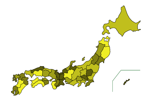
color = [RGB(i, 0, 0) for i = 0.2:1/5:1];
colormap(collect(1:47), color=rand(color, 47));

codelist = vcat(collect(8:15), 19, 20);
colormap(codelist, color=rand(color, length(codelist)))

# colormap1

x = rand(47)
colormap1(x; colornumber=8)

# colormap2

t = [0.2, 0.5, 0.8, 1] # 任意の段階
colormap2(x, t, colornumber=4)
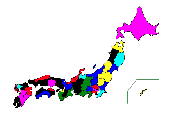
# colormap3

funky = [:red, :blue, :yellow, :green, :cyan, :magenta, :black]
t = collect(0.1:0.15:0.85)
colormap3(rand(47), t, funky)

# colormap4

prefs = vcat(collect(7:15), 19, 20)
marks = [10, 13]
colormap4(prefs, marks, RGB(0.4, 0.6, 0.8), RGB(0.85, 0.93, 0.95))

コメント
  • X
  • Facebookでシェアする
  • はてなブックマークに追加する
  • LINEでシェアする

Julia の小ネタ--003 ファイルからベクトルに読み込むプログラム

2021年02月22日 | ブログラミング

ファイルからベクトルに読み込むプログラム

一行に 2 個の整数をタブで区切って入力しているファイルがある。
1 2
3 4
5 6
 :

これを,nx2 の行列に読み込むとき,str へ readline() で読み込んで,なまじ「改行文字は \r」と思っていたので,split(str, "\r") のようにしたら,最後の行で
input string is empty or only contains whitespace
となってしまった。split(str) だけでよかったのだ。

その後も,reshape() しようかそれとも別の方法にしようかと悩んだが,
結局 x = intxy[1:2:end],y = intxy[2:2:end] のほうがわかりやすいか?と思った次第。

f = open("jpn/13", "r")
str = readline(f);
close(f)
strxy = split(str);
intxy = parse.(Int, strxy);
x = intxy[1:2:end]
y = intxy[2:2:end]

最初の 3 行を 1 行で書いてもよいが,ちょっとお行儀が悪いかな?

str = readline("jpn/13")
strxy = split(str);
intxy = parse.(Int, strxy);
x = intxy[1:2:end]
y = intxy[2:2:end]


コメント
  • X
  • Facebookでシェアする
  • はてなブックマークに追加する
  • LINEでシェアする

Julia の小ネタ--002 変数の書式付き出力

2021年02月22日 | ブログラミング

変数の書式付き出力

Julia の println() で,出力文字列中に「$変数名」を記述すれば,その場所に変数の値が出力されるのは,よく知られている。Python では 「{変数名}」 とするやつだ。

x = sqrt(2)
println("x = $x") # x = 1.4142135623730951

しかし,これだと小数点以下が長すぎるとか,困ることもある。

そこで,Printf パッケージの @printf()@sprintf() を使えば C や Python のような % 書式を使うことができる。

using Printf

@printf("n = %05d, x = %.7g", 11, x) # n = 00011, x = 1.414214

@sprintf "n = %05d" 11               # "n = 00011"
@sprintf "pi = %.7g" pi              # "pi = 3.141593"


Formatting パッケージの format でも @sprintf と同じようなことができるが,g, G 変換がまだサポートされていないので,私としては対象外だ。

using Formatting

format("n = {:05d} pi = {:.7e}", 5, pi) # "n = 00005 pi = 3.1415927e+00"

コメント
  • X
  • Facebookでシェアする
  • はてなブックマークに追加する
  • LINEでシェアする

PVアクセスランキング にほんブログ村

PVアクセスランキング にほんブログ村