goo blog サービス終了のお知らせ 

gooブログはじめました!

写真付きで日記や趣味を書くならgooブログ

BMW First Loss in 10 Years amidst the Change in Branding

2020-03-25 22:08:55 | logo design


BMW is a German multinational company. Founded in 1916 as an aircraft engine manufacturer, the company is now famous for producing automobiles and motorcycles. After 100 years since its creation, BMW sold over 2.1 million cars, along with catering employment for over 100,000 people all around the world.

Now BMW is the second biggest luxury carmaker of the world, after Mercedes-Benz.
The company got its professional logo design revamped for the 6th time since 1917 – the year when BMW launched its first logo.

This new logo design has a blue-and-white pattern at its center. Blue and white are the colors of BMW’s home state of Bavaria in Germany. The fact about flag color also cancels out the myth that spun around the world for years, interpreting the company’s logo design as a propeller as it was portrayed in the 1929 ad.

This new logo design portrays a more minimalistic look to go along with the latest logo design trends. According to the company, this new professional logo design will only be used for documentation and branding purposes for the digital age.

Although BMW is making efforts to connect with the new generation, the millennials are finding it hard to go along with this new branding technique. They feel more related to the heavily designed 3D effect logo design.
While this debate of liking this new logo goes on, the company also gets hit with the worst news facing a massive loss of its history. They have suffered a downturn in demand and record-spending after years of growth.
Many say the reason behind this loss could be because of their rebranding. However, ups and downs are part of business deals. It’s time to wait and see what new measures the company takes to regain its profit rate.

Visit Uptown Logo Design to get a professional logo design for your website.

Fisher-Price Logo Design: A Lively Revamp It So Deserves

2020-02-24 21:51:32 | professional logo designer
 

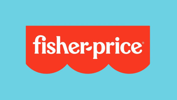
The all famous toy brand Fisher-Price which we probably have all known and loved our entire childhood recently revamped their logo design. Thanks to Pentagram, a NewYork based logo design company for perfectly inculcating the brand’s personality into the new logo design. 
The logo designers retained the classic colors and moved the logo from a four semi-circle to a three semi-circle representing the brand's three founders (Herman Fisher, Irving Price, and Helen Schelle, who sadly didn't get to become a part of the brand). The vibrant and bright red is more appealing to the eyes and much appreciated by everyone. As for the typeface, it is closely tied to the original type used in the previous logo. The FI ligature looks funky and cool and makes it perfect for a toy brand. Emily Oberman, a professional logo designer didn’t change the H ligature didn’t change probably because its one of the most iconic elements of the overall logo design and, if removed, it may have taken the essence of the brand away. Another recognizable element includes the tails of the alphabet E. The most creative part of the revamped logo is that they have used the semi-circles at the bottom to create the shape of hyphen which connects the elements of the design and gives it a more harmonious look making it the best logo design


After conducting extensive research, Pentagram discovered that the iconic typeface Cheltenham was used extensively when the brand first originated and so designer Jeremy Mickel implied it in the logo design. The newly designed typeface relates more to a kid’s toy brand.
About the monogram, the placement and angles of the alphabets are very playful and represent children’s brand really well. While the vibrant animated graphics may not be cogent as much as the revamped logo, they still managed to impress the target market with their breezy childlike vibe.
In nutshell, pentagram successfully revamped the logo leaving the target audience happy. It seems like the team had fun providing logo design services provided the company is all about playing and having fun. The team managed to bring something new while still retaining the original essence of the brand. Emily Oberman and the team surely deserve all the appreciation.