


The all famous toy brand Fisher-Price which we probably have all known and loved our entire childhood recently revamped their logo design. Thanks to Pentagram, a NewYork based logo design company for perfectly inculcating the brand’s personality into the new logo design.
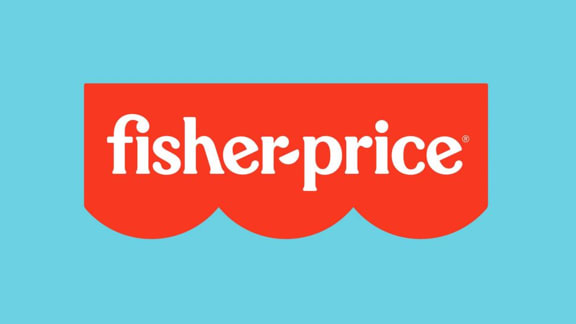
The logo designers retained the classic colors and moved the logo from a four semi-circle to a three semi-circle representing the brand's three founders (Herman Fisher, Irving Price, and Helen Schelle, who sadly didn't get to become a part of the brand). The vibrant and bright red is more appealing to the eyes and much appreciated by everyone. As for the typeface, it is closely tied to the original type used in the previous logo. The FI ligature looks funky and cool and makes it perfect for a toy brand. Emily Oberman, a professional logo designer didn’t change the H ligature didn’t change probably because its one of the most iconic elements of the overall logo design and, if removed, it may have taken the essence of the brand away. Another recognizable element includes the tails of the alphabet E. The most creative part of the revamped logo is that they have used the semi-circles at the bottom to create the shape of hyphen which connects the elements of the design and gives it a more harmonious look making it the best logo design.

After conducting extensive research, Pentagram discovered that the iconic typeface Cheltenham was used extensively when the brand first originated and so designer Jeremy Mickel implied it in the logo design. The newly designed typeface relates more to a kid’s toy brand.
About the monogram, the placement and angles of the alphabets are very playful and represent children’s brand really well. While the vibrant animated graphics may not be cogent as much as the revamped logo, they still managed to impress the target market with their breezy childlike vibe.
In nutshell, pentagram successfully revamped the logo leaving the target audience happy. It seems like the team had fun providing logo design services provided the company is all about playing and having fun. The team managed to bring something new while still retaining the original essence of the brand. Emily Oberman and the team surely deserve all the appreciation.